
Provide Faster Insights to your Team with Widget Descriptions
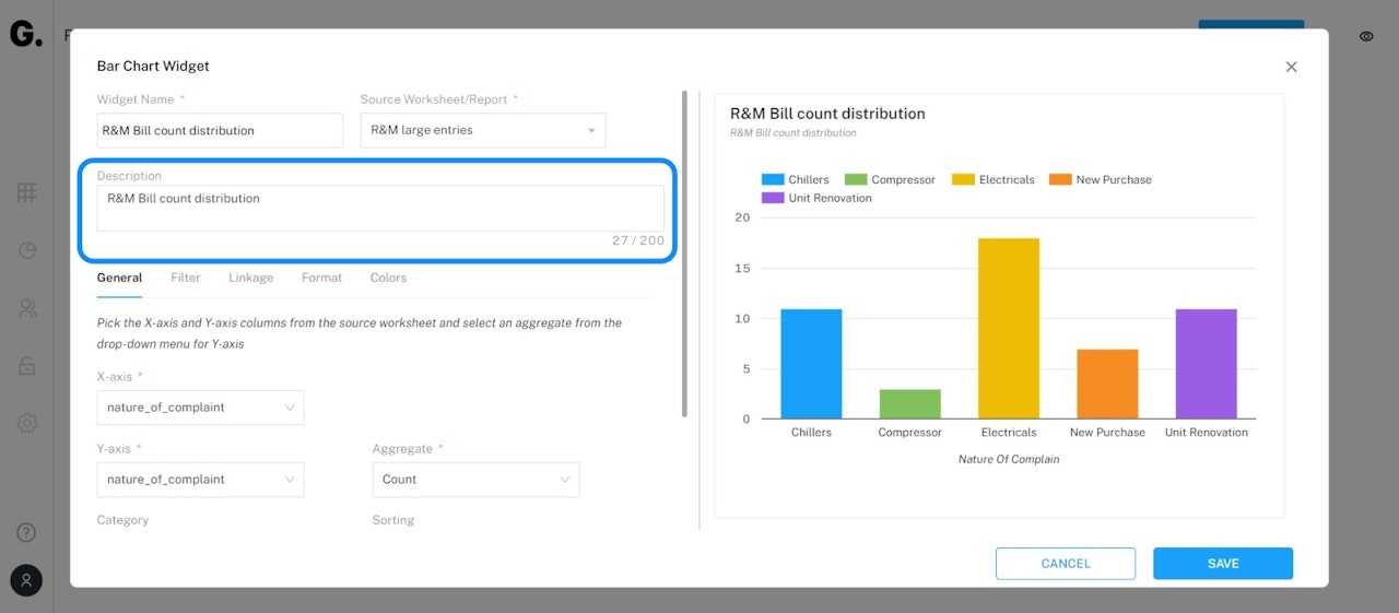
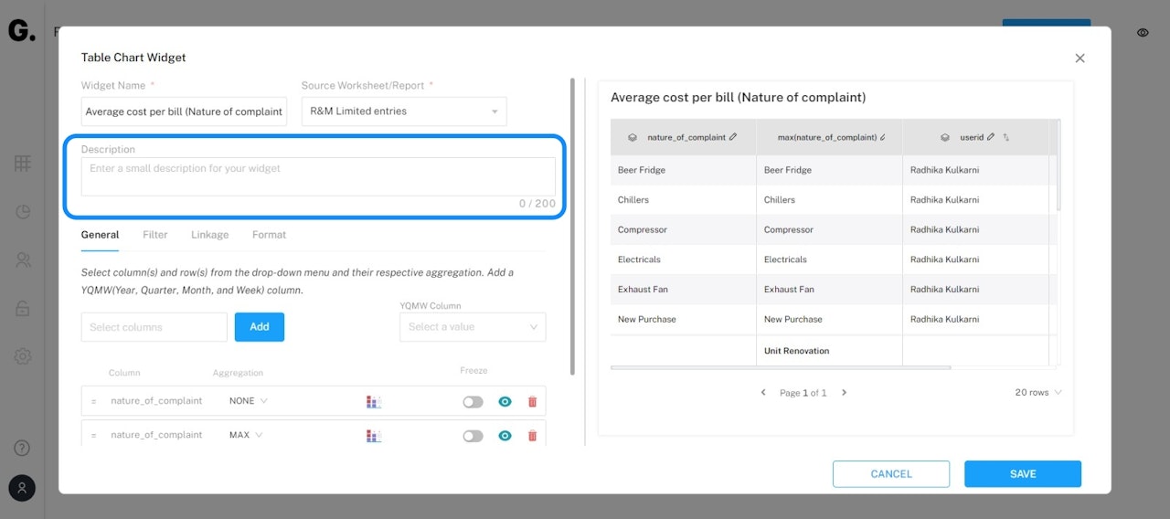
Add descriptions to each of your widgets and provide better insights to your team!
This functionality is available on all widgets (except Map and Striplog).
Just create a widget and add a description. This description will be visible under the widget name. It's that simple!

Conduct Detailed Analysis by making Period-on-Period Comparison
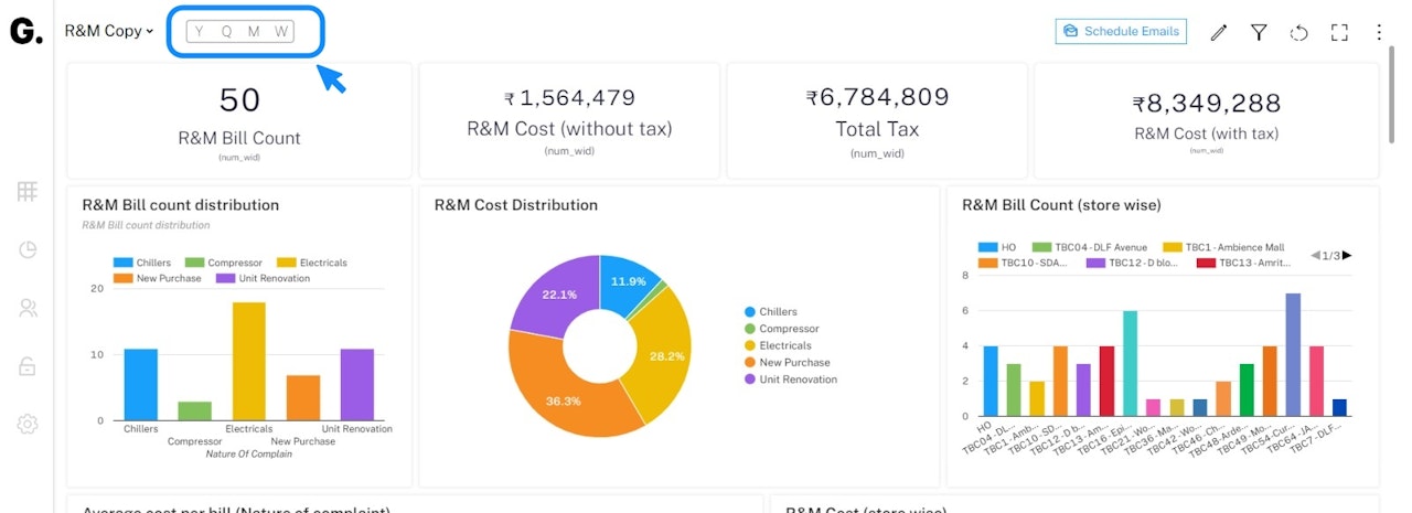
Easily conduct detailed analysis using the YQMW (Year Quarter Month Week) toggle and applying the period on all widgets of a dashboard!
Data Linkage - Quicker Access to Source Data, Faster Responses by Managers
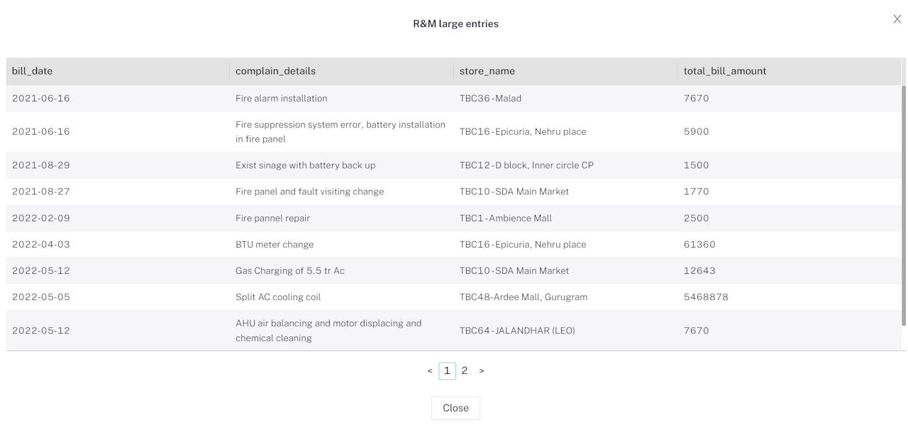
Easily set up a customized view from your source worksheet/report using Data Linkages. Drill deeper into your data with a click of a button and gain better insights. Notice anomalous data and take immediate action.
Click on a part of a widget and access source data.

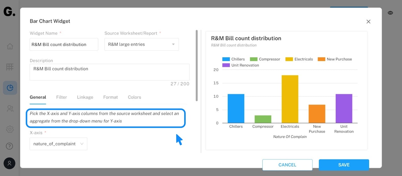
Help Texts for an Interactive User Experience
Help Texts throughout the dashboard lets you have a seamless user experience!

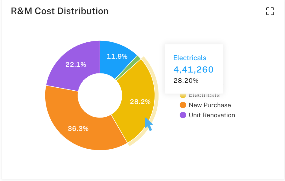
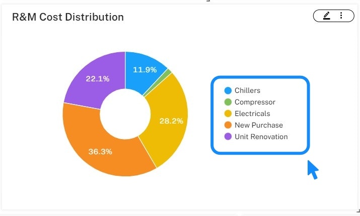
Legends on Donut Chart Move to the Right
Visualize better with the legends on the Donut chart. Now clearly visible on the right-hand side!

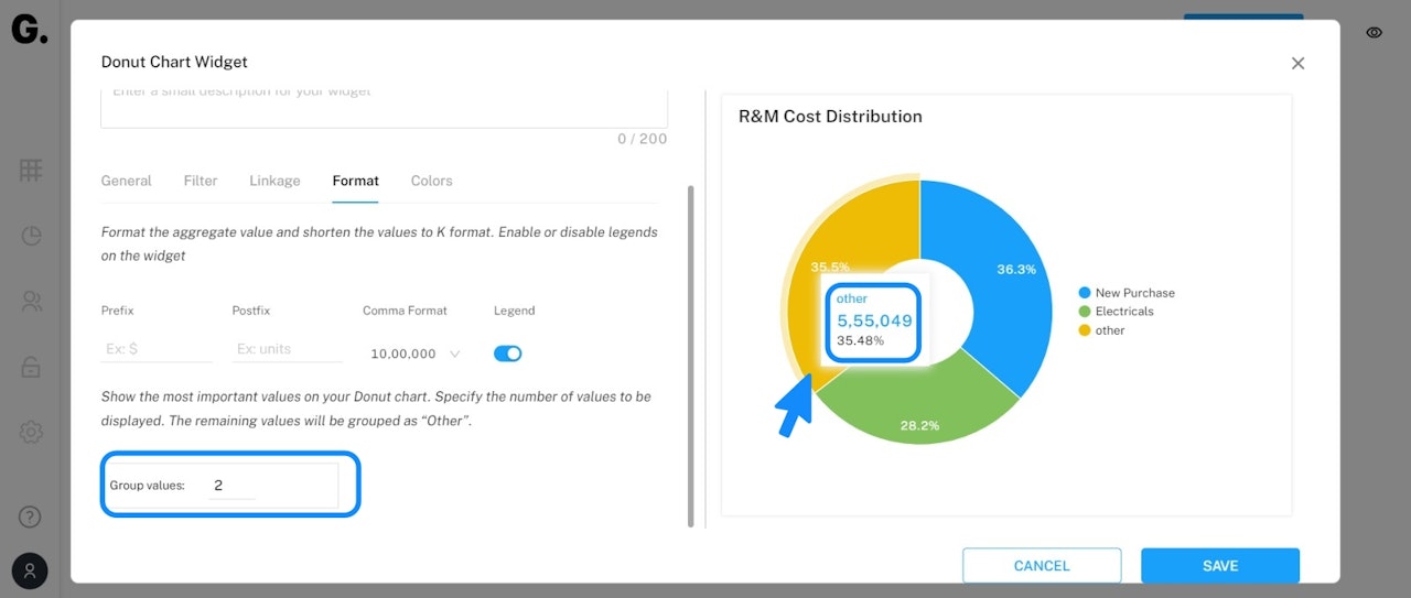
Group Lower Percentages as “Other” on Donut Charts
Lower percentages on a dashboard can now be grouped together!
This lets you easily see the relevant data. Simply, specify the number of values to be displayed. The remaining values will be grouped as “Other”.

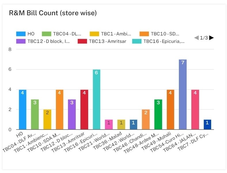
Show Values on Bar Charts
Enable the “Show values” toggle and analyse your data at a glance!
No click, No hover.

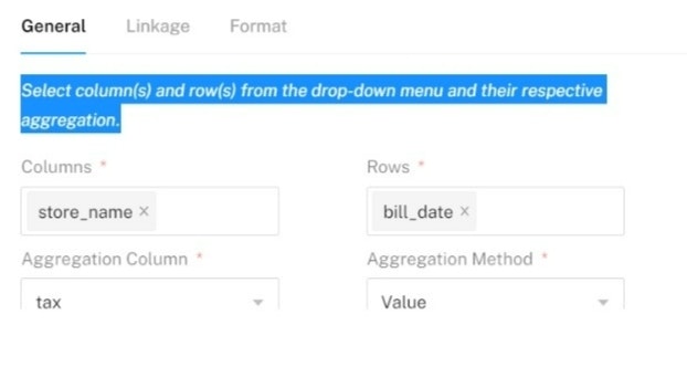
X-axis and Y-axis get new names in Pivot Table
X-axis and Y-axis have been renamed to Columns and Rows respectively for clarity.

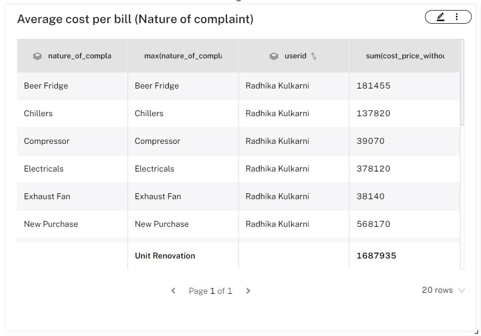
Table widget has a new look!
Visualize tables better with:
Easy-to-Navigate pagination
Alternating colors to track records
Header formatting options
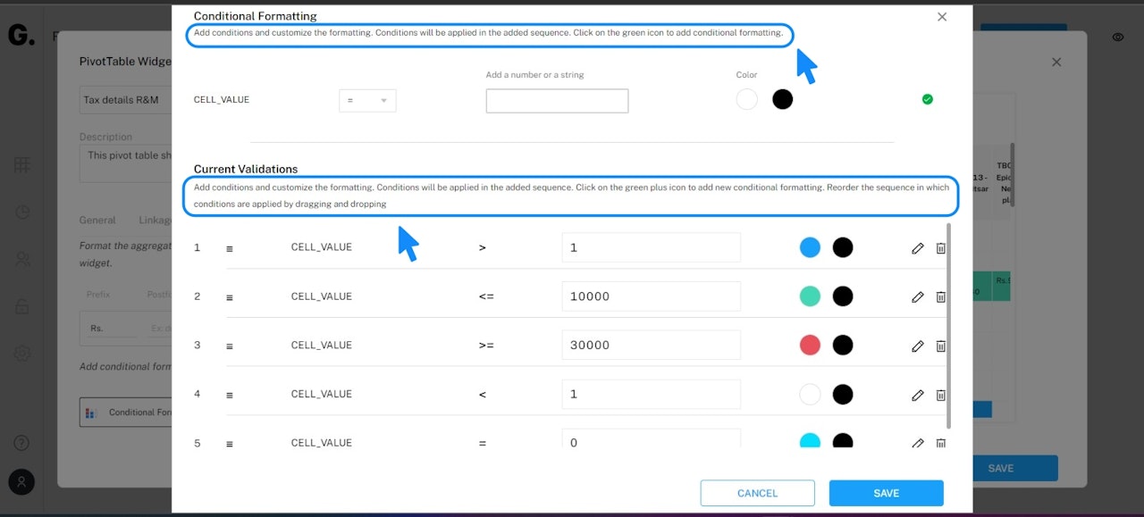
Adding Conditional Formatting has never been EASIER!
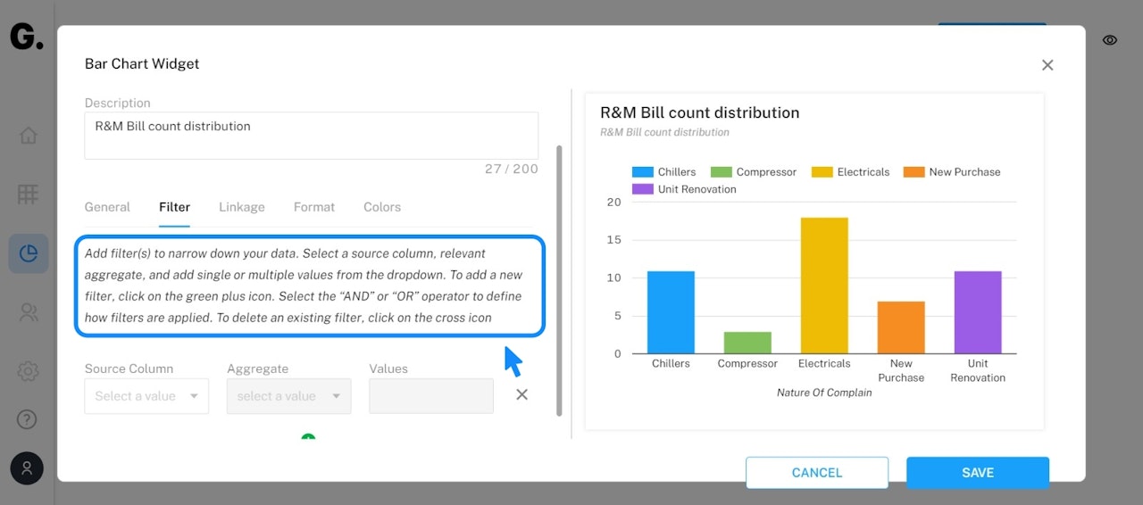
Help texts will now guide you to add conditional formatting!
Easily reorder the sequence in which conditions can be applied as well!
